





September 3rd, 2026 | Interview with Bivo team member Mark Beard
He's wacky, he's got a wicked eye for design, and he just might make a t-shirt with your name on it! Mark Beard is Bivo's Creative director and the man behind our newest limited edition colorway: Order In Chaos. Mark's creativity touches so many parts of Bivo and we simply wouldn't be Bivo without him! Today, I've interviewed Mark to hear from him about what makes his creative mind tick.
He's wacky, he's got a wicked eye for design, and he just might make a t-shirt with your name on it! Mark Beard is Bivo's Creative director and the man behind our newest limited edition colorway: Order In Chaos. Mark's creativity touches so many parts of Bivo and we simply wouldn't be Bivo without him! Today, I've interviewed Mark to hear from him about what makes his creative mind tick.
I met Carina back when I was working with a design agency in Portland. She was a footwear developer and our team was actually working on a rebrand for an Australian footwear brand. After working together, we realized we had a lot of similarities in our design methodologies and values.
It all goes on down there, just with more open space, less traffic, better wine, cleaner air and water and a shedload more snakes and sharks.
I met Carina back when I was working with a design agency in Portland. She was a footwear developer and our team was actually working on a rebrand for an Australian footwear brand. After working together, we realized we had a lot of similarities in our design methodologies and values.
It all goes on down there, just with more open space, less traffic, better wine, cleaner air and water and a shedload more snakes and sharks.


Inspiration has never been other designers work – its always been in the process or the people themselves who’ve had an impact on me. I would have to say that working at Herman Miller (and for them as an agency for many years) was one of the strongest influences on how I think about design. So you could say that Ray & Charles Eames and their commitment to ‘Serious Play’... I’ve always thought that levity brings a sense of comfort, which in turn lets people think tangentially about things they normally get constrained by…. So long story short, turns out I do have inspiration from the Eames’s!
Inspiration has never been other designers work – its always been in the process or the people themselves who’ve had an impact on me. I would have to say that working at Herman Miller (and for them as an agency for many years) was one of the strongest influences on how I think about design. So you could say that Ray & Charles Eames and their commitment to ‘Serious Play’... I’ve always thought that levity brings a sense of comfort, which in turn lets people think tangentially about things they normally get constrained by…. So long story short, turns out I do have inspiration from the Eames’s!
As far as mentors go … I have never officially given that moniker to anyone (maybe just out of laziness) but I’d say a couple of people have influenced my understanding of design in positive ways.
I would say Matt Cappozzi of North Drinkware – the dude could see around corners to problems in the human experience around products and would always come to solutions in a fun and playful way. Often involving accidental F-bombs in meeting rooms … Which I consider a sign of comfort and honesty in design.
And for a very brief period before his retirement at Herman Miller after 40+ years – Steve Frykholm … A legend of American, folk modern graphic design. After a week of working at Herman Miller I was standing at a desk with Amy Auscherman (most learned human being on modern American design there is on the planet – I challenge anyone to challenge that!) Steve, and Ben Watson looking at never-been-seen-before sketches of clocks by George Nelson that were found in the attic of Irving Harper (at the ripe old age of 99).... I had to pinch myself to think that this bogan bloke from Adelaide was actually in such company.
As far as mentors go … I have never officially given that moniker to anyone (maybe just out of laziness) but I’d say a couple of people have influenced my understanding of design in positive ways.
I would say Matt Cappozzi of North Drinkware – the dude could see around corners to problems in the human experience around products and would always come to solutions in a fun and playful way. Often involving accidental F-bombs in meeting rooms … Which I consider a sign of comfort and honesty in design.
And for a very brief period before his retirement at Herman Miller after 40+ years – Steve Frykholm … A legend of American, folk modern graphic design. After a week of working at Herman Miller I was standing at a desk with Amy Auscherman (most learned human being on modern American design there is on the planet – I challenge anyone to challenge that!) Steve, and Ben Watson looking at never-been-seen-before sketches of clocks by George Nelson that were found in the attic of Irving Harper (at the ripe old age of 99).... I had to pinch myself to think that this bogan bloke from Adelaide was actually in such company.
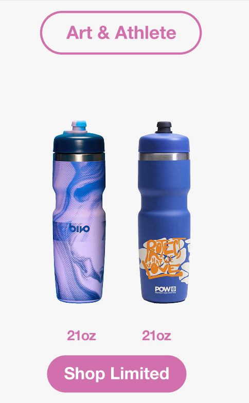
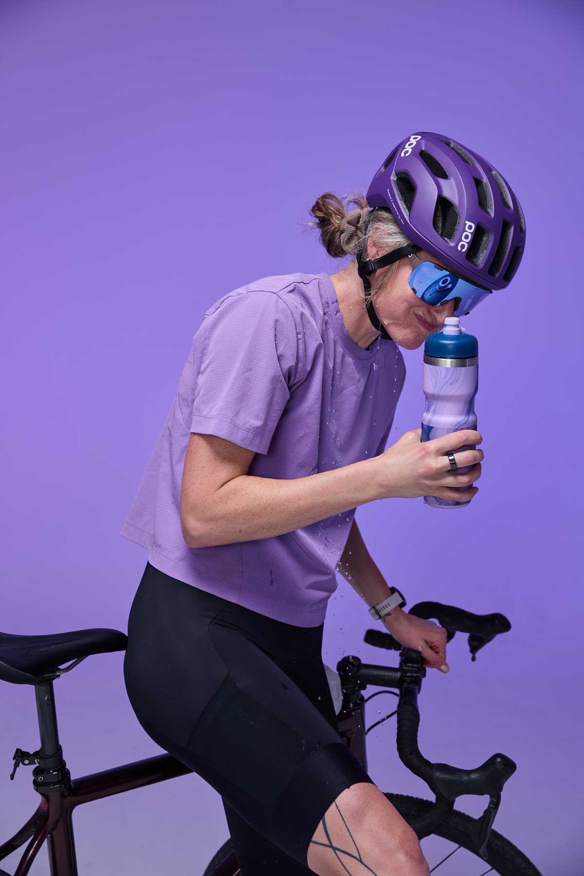
The trigger for the OIC bottle was really the idea of representing the inside on the outside …. We’ve often used the term "show the flow" in our communications as a bit of a rallying cry for why our bottle is different - so why not represent that as art on the outside as well as the inside of the bottle!? The halftone pattern is a throwback to my early days a print graphic designer… Everyone has said how much they like the texture of the bottle when they pick it up.
The trigger for the OIC bottle was really the idea of representing the inside on the outside …. We’ve often used the term "show the flow" in our communications as a bit of a rallying cry for why our bottle is different - so why not represent that as art on the outside as well as the inside of the bottle!? The halftone pattern is a throwback to my early days a print graphic designer… Everyone has said how much they like the texture of the bottle when they pick it up.


Actually it was all teamwork that one … I had no name for it and someone on the team gave it a name while we were testing it - and it stuck :) I think it works perfectly – a nice blend of the scrappy halftone layers with the smooth flow of the water texture.
Actually it was all teamwork that one … I had no name for it and someone on the team gave it a name while we were testing it - and it stuck :) I think it works perfectly – a nice blend of the scrappy halftone layers with the smooth flow of the water texture.



I think 2 things pop to mind …
1 – our Gravity Flow Stations for Bivo… they represent all the brand pillars we stand for at Bivo:
They are Scrappy-Smart – made locally, inexpensive to make I pack and ship them all over the world after our events so they have a double life as retail fixtures as well as event displays.
Function First – they hold 200+ bottles on display, they hold our brand communications panels, they flat pack for shipping and are put together with no glue or screws.
Have Fun – the little water droplet shapes are a fun way to represent our brand and they are keychains we give out at events and to our sales reps which hold / show off our dust caps.
I think 2 things pop to mind …
1 – our Gravity Flow Stations for Bivo… they represent all the brand pillars we stand for at Bivo:
They are Scrappy-Smart – made locally, inexpensive to make I pack and ship them all over the world after our events so they have a double life as retail fixtures as well as event displays.
Function First – they hold 200+ bottles on display, they hold our brand communications panels, they flat pack for shipping and are put together with no glue or screws.
Have Fun – the little water droplet shapes are a fun way to represent our brand and they are keychains we give out at events and to our sales reps which hold / show off our dust caps.

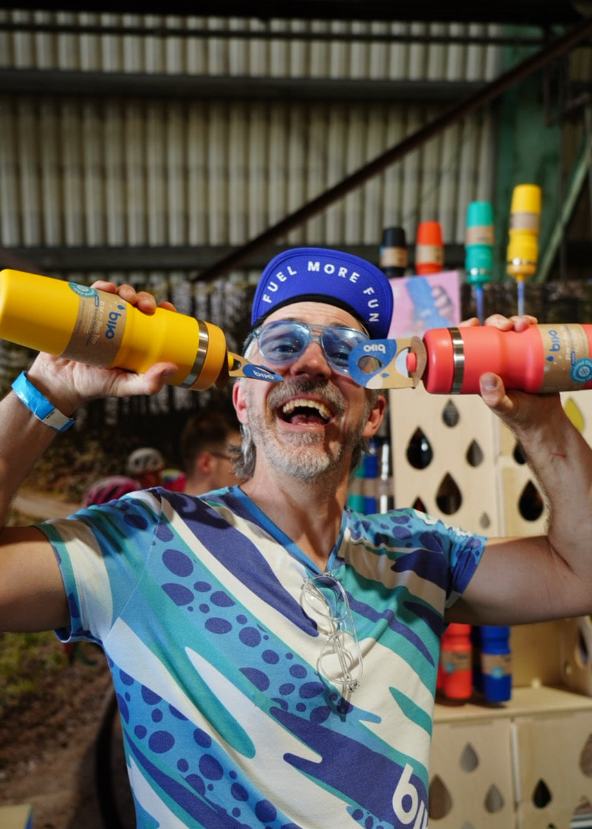
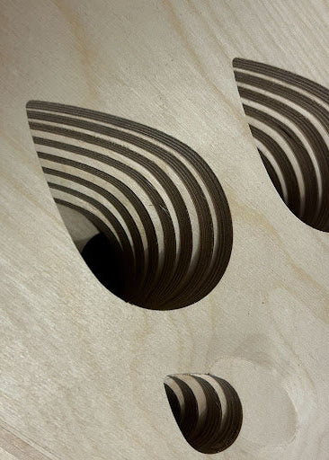
Above: Mark at MADE 2025 with some of the first iterations of our Gravity Flow Stations
Above: Mark at MADE 2025 with some of the first iterations of our Gravity Flow Stations
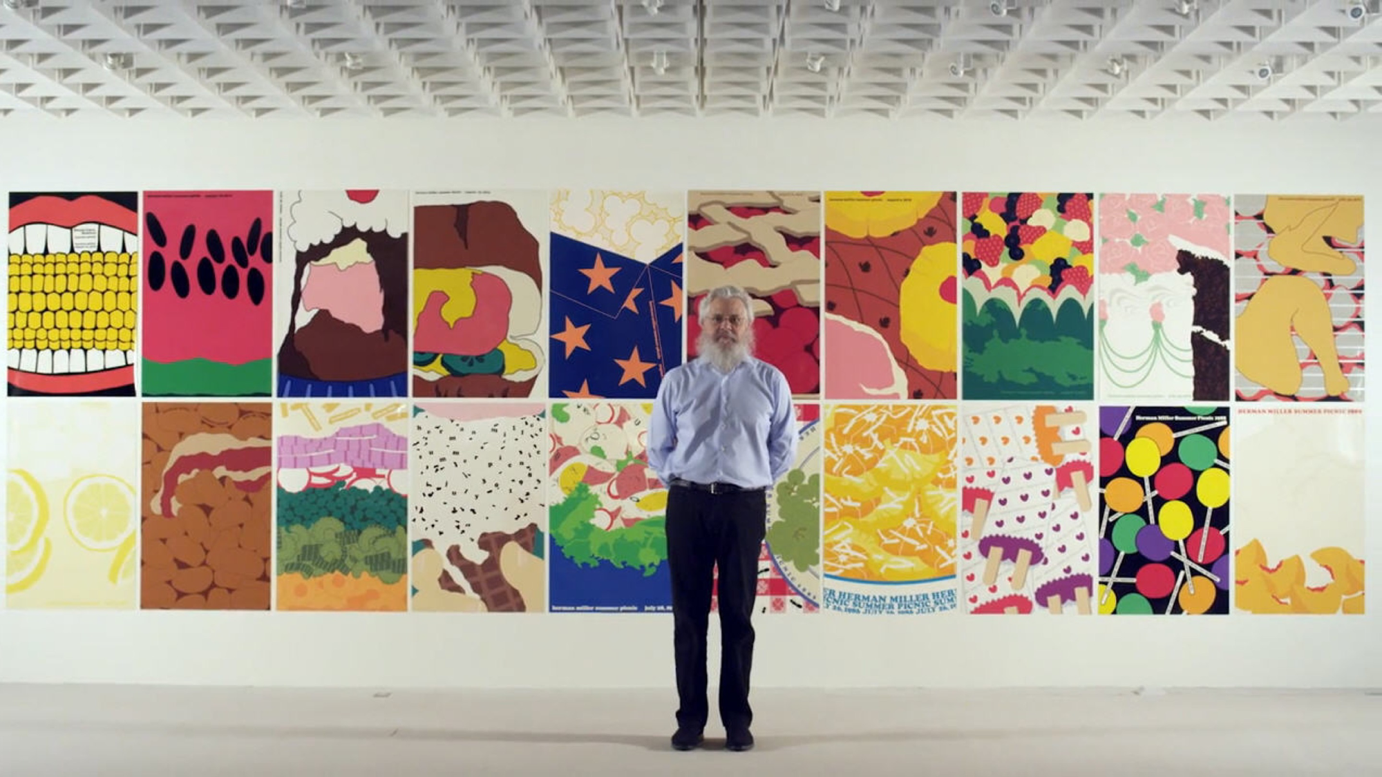
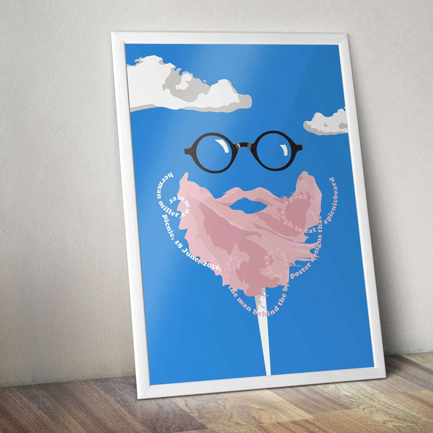
2 – 2016 Picnic Poster for Herman Miller – being able to work on Steve Frykholm’s retirement project where we went back to the original screen printer he used in the 80’s to make a poster for the Herman Miller Picnic in 2016 of him, and in honor of his retirement. The poster is now sitting in the permanent archives of the Cranbrook Museum of Art – alongside his work, as well as those of Eero Sarineen and Charles and Ray Eames. Kinda ridiculous to think about as a bogan bloke form Adelaide.
2 – 2016 Picnic Poster for Herman Miller – being able to work on Steve Frykholm’s retirement project where we went back to the original screen printer he used in the 80’s to make a poster for the Herman Miller Picnic in 2016 of him, and in honor of his retirement. The poster is now sitting in the permanent archives of the Cranbrook Museum of Art – alongside his work, as well as those of Eero Sarineen and Charles and Ray Eames. Kinda ridiculous to think about as a bogan bloke form Adelaide.
Its gotta be dave … Surely :) Sam Noel, our analyst and product forecasting guru did a search through Shopify once and figured out that 2% of all our DTC sales went to humans with the name DAVE!!!! … We all just thought this was the funniest thing - me in particular, so Sam wears the dave / bivo logo tee and just kinda became his alter ego 🙂
Its gotta be dave … Surely :) Sam Noel, our analyst and product forecasting guru did a search through Shopify once and figured out that 2% of all our DTC sales went to humans with the name DAVE!!!! … We all just thought this was the funniest thing - me in particular, so Sam wears the dave / bivo logo tee and just kinda became his alter ego 🙂
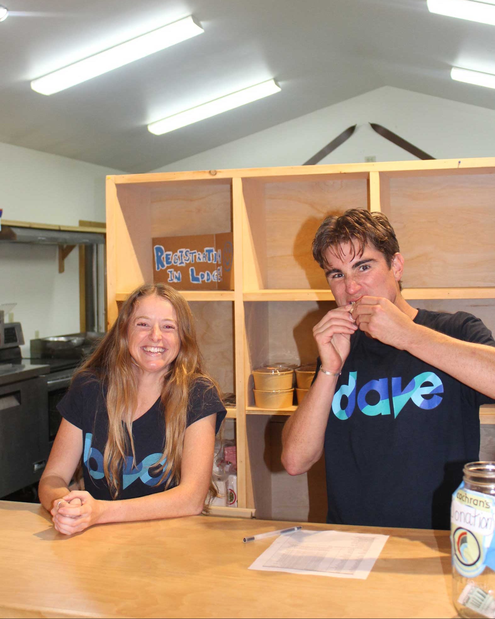

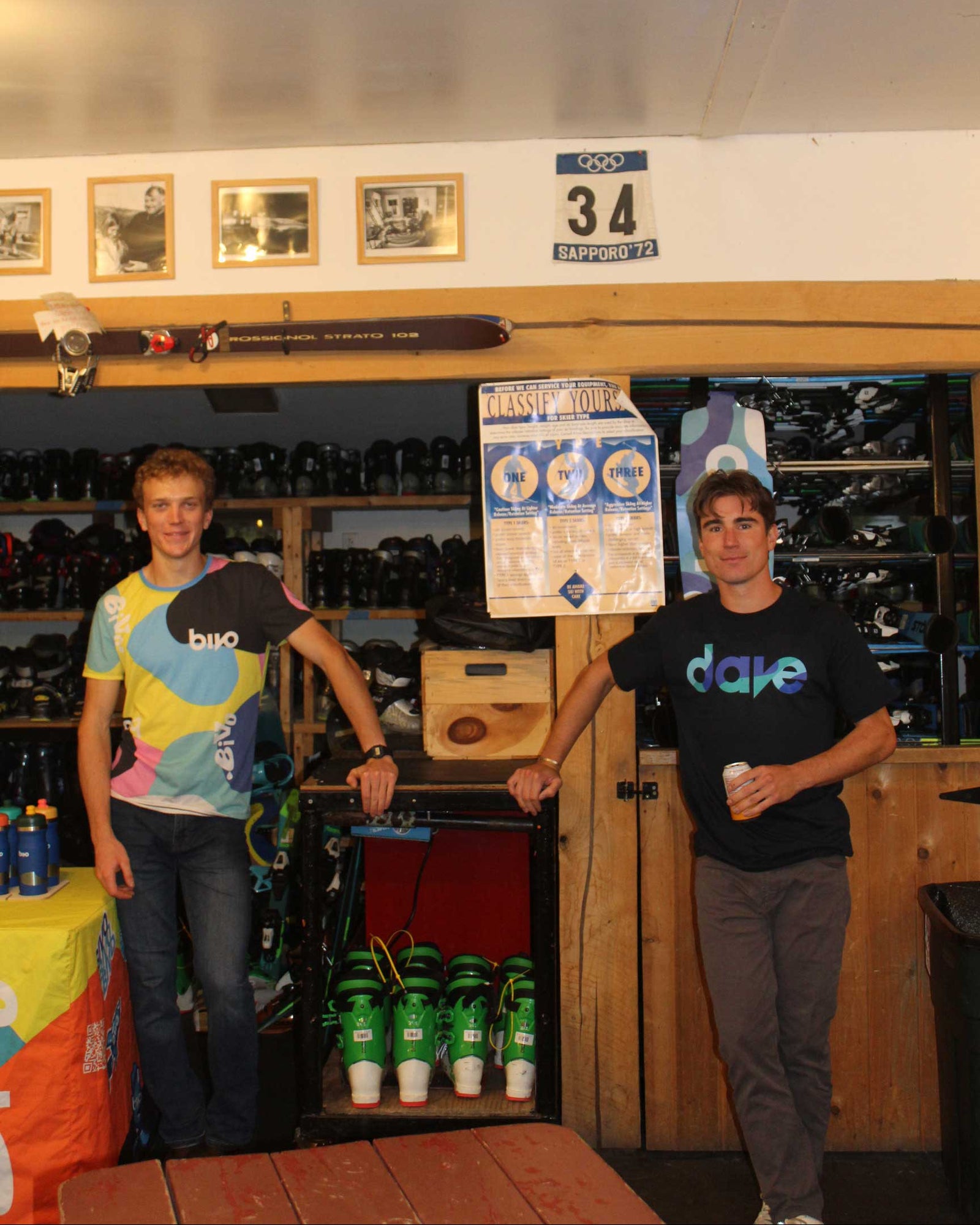

Above: Sam sporting his custom 'Dave' shirt at our movie night we held at our local ski hill.
Above: Sam sporting his custom 'Dave' shirt at our movie night we held at our local ski hill.
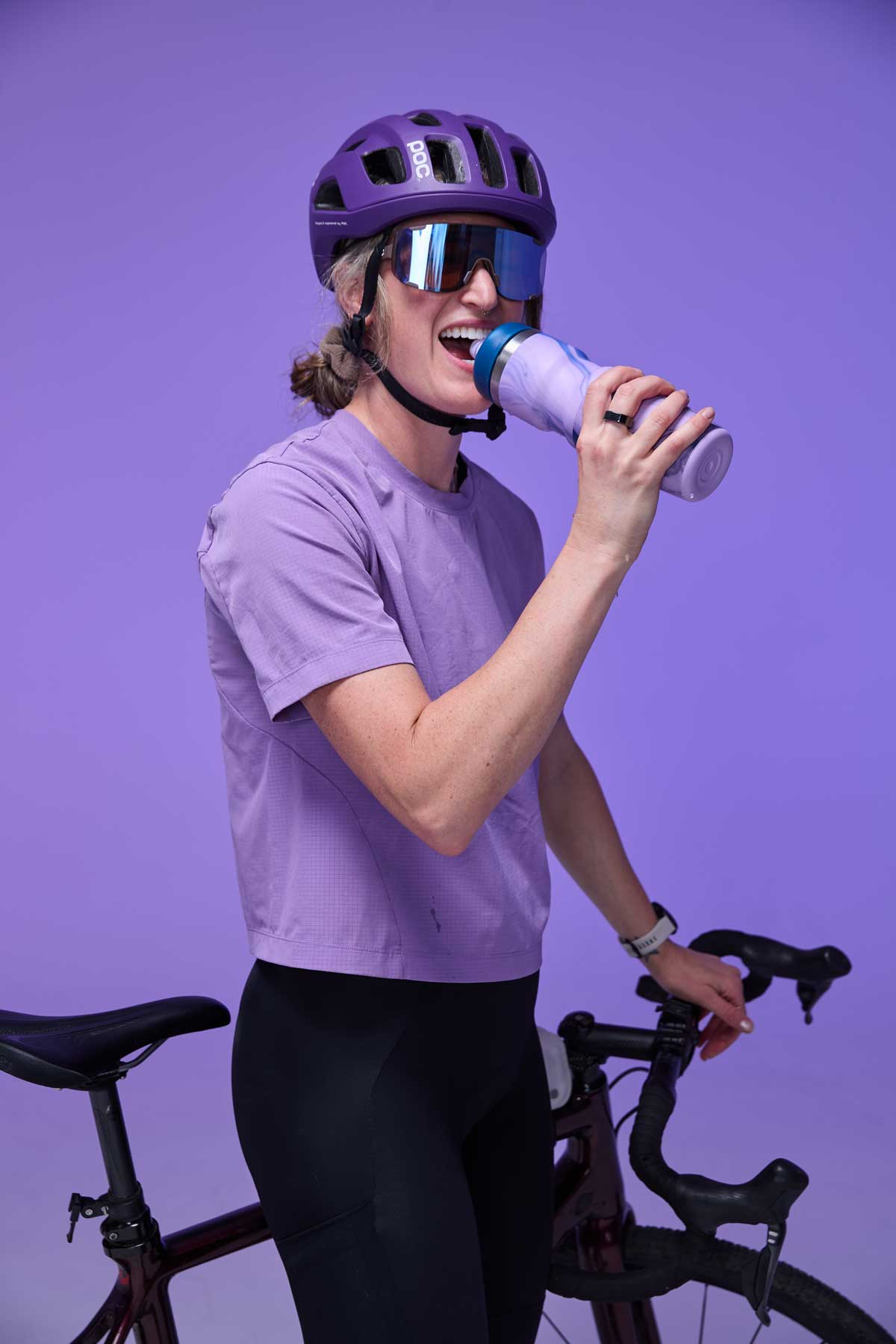
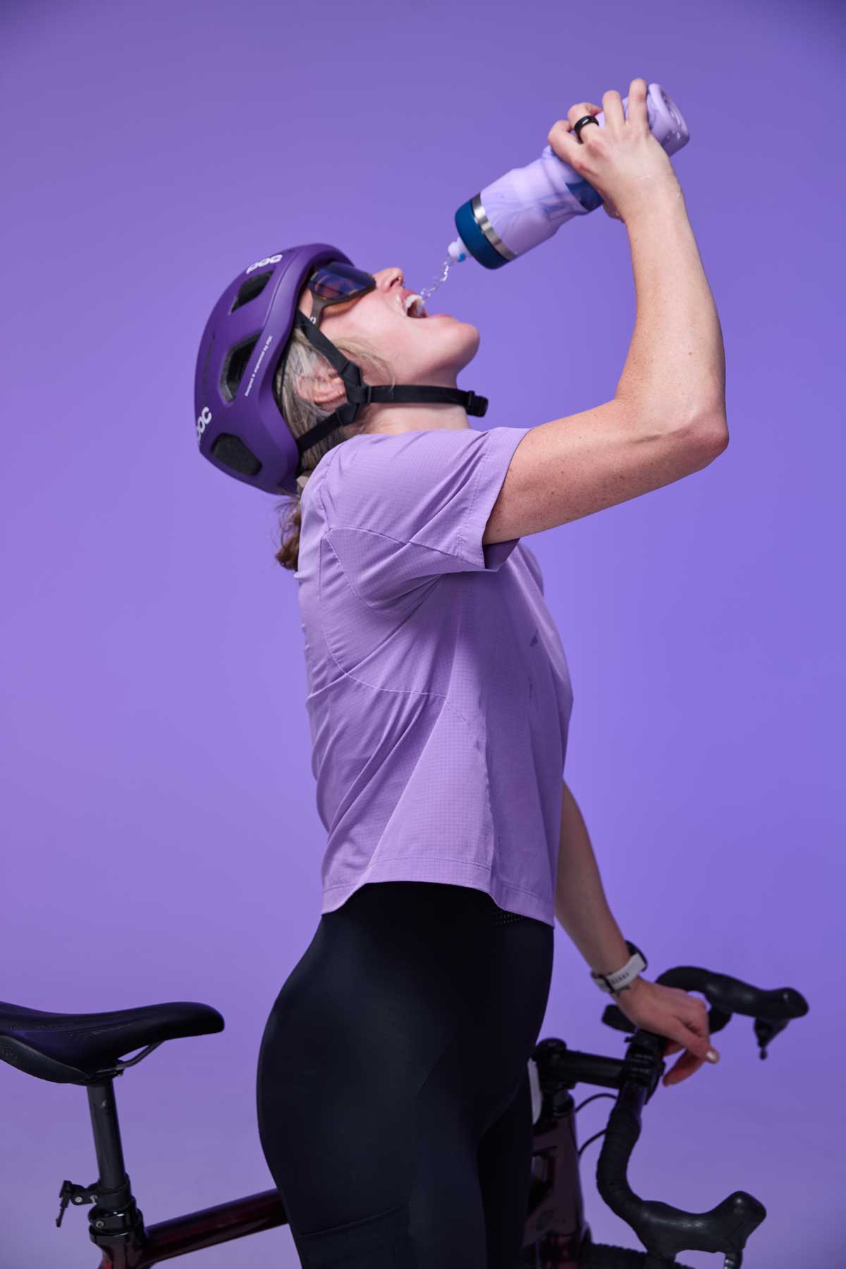
The beautiful purple bottle features a blue flow-y pattern designed by our very own Bivo team member Mark Beard. Plus, the bottles nozzle is a unique new tie-dye creation.
*No two nozzles are alike!
The beautiful purple bottle features a blue flow-y pattern designed by our very own Bivo team member Mark Beard. Plus, the bottles nozzle is a unique new tie-dye creation.
*No two nozzles are alike!






Leave a comment (all fields required)